Defines whether an item is displayed with a border. Borders are drawn as a three dimensional effect.
Syntax
<border>status</border>
| Parameter | Type | Description |
|---|---|---|
| status | on | Item has a border. |
| off | Item does not have a border |
Available in
box, button, check, checkgroup, combobox, field, label, line, list, pane, popup, radio, radiogroup, richtext, slider, table
Example
This sample sets the item to display a border:
<border>on</border>
Usage details
- Default:
- For label, checkgroup, radiogroup, table, and pane items, the default is always off.
- For all other items, the default is on.
- For the following items, you can use the borderinfo option to control border style and color: box, button, checkgroup, combobox, field, label, line, list, pane, popup, radiogroup, slider, and table.
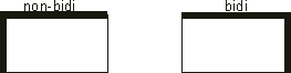
- If a 3D border is used with a bidirectional language or if the
orientation option of an item is set to Right-To-Left (rtl), the border
will change to the Right-To-Left orientation. For example: